City of Brooklyn Center
Designing a new website
Project Overview
The City of Brooklyn Center needed help designing a new website to communicate updates and information about radical public safety reforms taking place in their community. My team and I conducted a competitive analysis, user interviews, a card sort, and usability testing to inform the design of an interactive prototype of the new website.
Planning Phase
Stakeholder Interview
Brainstorming session following stakeholder interview
My team met with the mayor of Brooklyn Center to learn about his mission and goals for the website. Key takeaways were:
Separate from the official city website
Tell the story of what happened in Brooklyn Center over the last year
Research repository for other cities wanting to implement similar public safety reforms
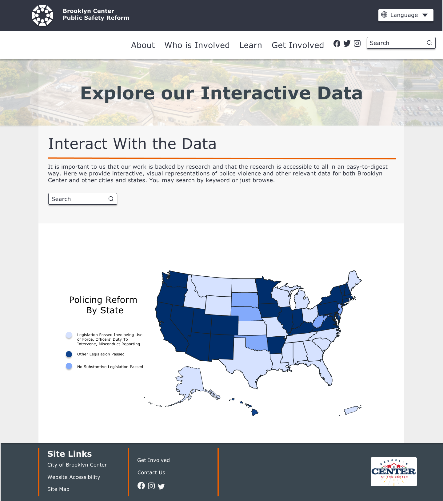
Interactive data visualizations that allow users to quickly grasp complex information
Competitive Analysis
We broke up this task by assigning a few websites, similar in theme to the one we were aiming to create, to each team member. We specifically looked at:
Were city demographics included?
Was a timeline of historical events included?
Was the public safety policy provided in its entirety?
Were financial allocations included?
Was data presented in a visual format?
Was there a place for community member engagement?
Were partner organizations listed?
Were future plans outlined?
User Interviews
Five Brooklyn Center residents were interviewed using the directed storytelling method. We wanted to both gauge their understanding of the new public safety resolution and learn what they might like to see on this website. We discovered that users want:
Communication Residents want to be made aware of progress occurring with the resolution and for two-way avenues of communication to exist.
Transparency Residents want the information provided to them to be clear and concise, with less jargon.
Data Residents want to see data that backs up the need for the public safety reforms taking place in Brooklyn Center.
Card Sort
I conducted an open card sort by having participants categorize the information that was to be included on the website’s pages. 15 users participated in the card sort. Some users participated in person and some virtually, using UXtweak’s platform.
I created a site map based on the findings, and this was iterated upon throughout the design process as we moved forward with wireframing and usability testing.
A/B Testing
Low-fidelity wireframes
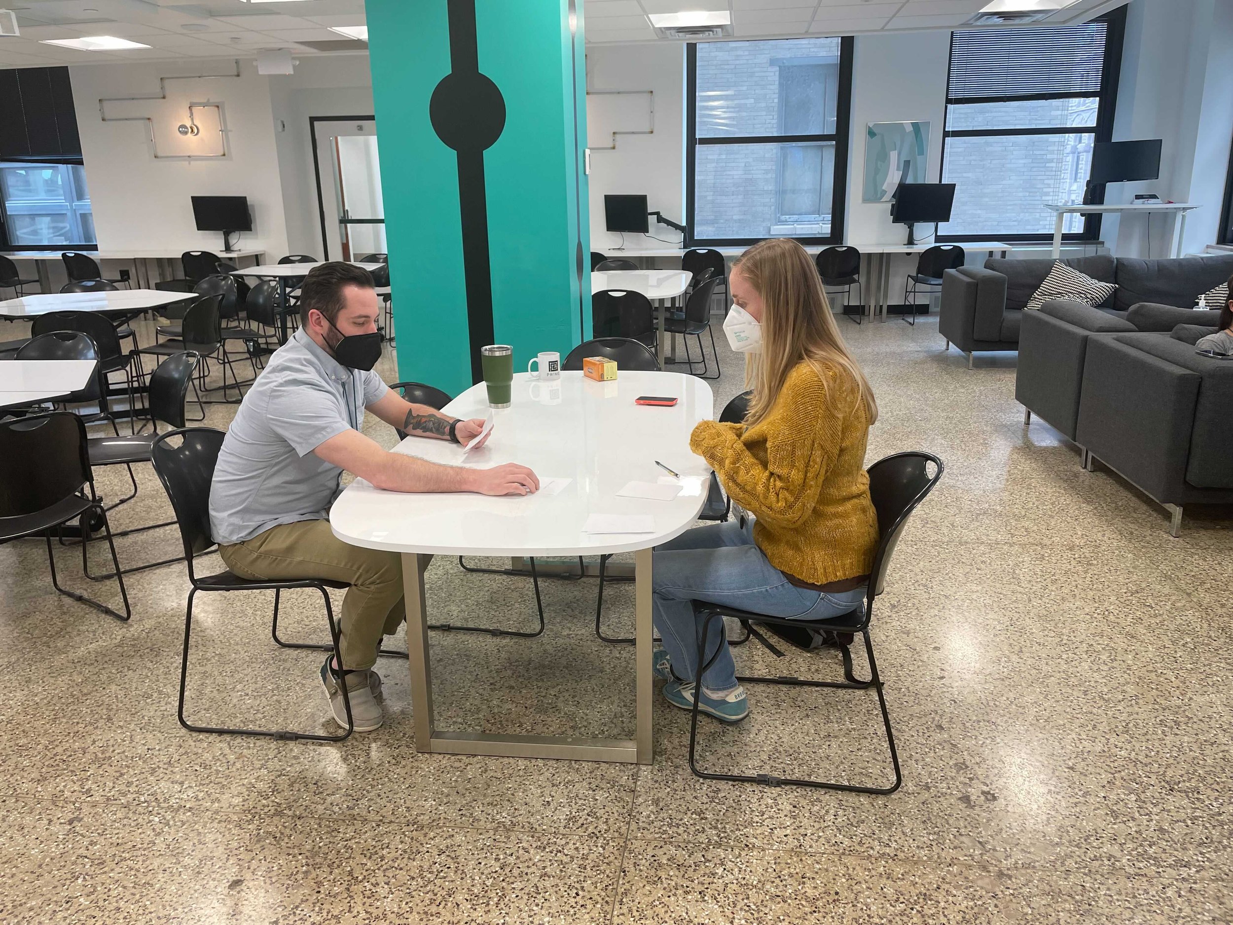
Next, we created low-fidelity wireframes based on our research findings. Two iterations of each page were placed in front of 5 users for moderated, 1-on-1 usability tests using think-aloud protocol.
Common Themes Uncovered:
Users want simpler navigation
Users want to understand the website’s purpose at a glance
Users want community members’ voices and stories front and center
Design Phase
Design System and Prototype
My team member Rose created a design system so that all of our screens were consistent. Each member of the team designed a portion of the website. Rose designed the landing page and the About sections, Justin designed the Who is Involved sections, Natalie designed the Get Involved sections, and I designed the Learn sections. The full clickable prototype can be viewed by clicking the button below.
Resource library page
Design System
Interactive data visualization
Conclusion
Next Steps
The next steps are:
Choosing the best hosting platform for the website
Making the website accessible to all Brooklyn Center residents by translating the content into other languages
Including more photos of Brooklyn Center residents to allow the community to see themselves reflected on the website
Reflection
Collaborating with a team of talented UX designers and researchers for this project was a rewarding and educational experience for me. I look forward to taking the communication and time management skills I learned with me as I move into my next UX project. I am excited to continue pushing myself to solve problems through human-centered approaches that stretch my mind and creative muscles.


